top of page
Logofolio
I’ve designed more logos and brands than I can remember. Somewhere along the way, I earned the nickname "Zuzana's logo factory".
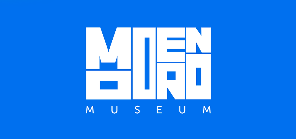
Musem Moderno

A bold, modular logotype built from geometric blocks that echo modernist architecture and contemporary art. The identity plays with rhythm, repetition and negative space, creating a visual language that feels both constructed and playful.


The Sound of BRAF

A modular identity system translating complex scientific data into a clean, rhythmic visual form. The logo reflects patterns found in biomarker signals, turning medical information into a contemporary, almost musical mark.


XBOM

A minimalist symbol created from a single continuous line, designed for a modern tech environment. Its simplicity and geometric precision make the mark flexible, scalable and instantly recognisable across digital platforms.
Created for an engineering and manufacturing company Hawk Ridge Systems (USA).


BMS Vibration

A warm, human-centred identity built from soft, organic shapes and balanced colour harmonies. The logo reflects emotional connection and movement, creating a friendly and approachable visual tone for the brand.


NMOSD – Uncover Details

A clean, grid-based design inspired by medical eye charts and diagnostic patterns. The identity plays with clarity, distance and focus – aligning the visual language with the idea of revealing what the eye cannot see at first glance.


Summary
A curated collection of logo designs created for different brands, purposes and visual tones. The logofolio highlights versatility in concept thinking, typography and symbolism – from minimal marks to more expressive identities.
Client: Various
Role: Art Direction | Logo Design
Type: Logo Design | Visual Identity
Year: 2019-2025
DesignTools: Logo design + visual concept development
Zuzana Kyppo
bottom of page
